You wake up with a scratchy throat and a heavy head, wondering if it’s just allergies or the start of the nasty bug going around the office. You have a big presentation on Thursday and a family wedding this weekend. Should you isolate, or are you just overthinking a dry throat? The uncertainty is exhausting. You need to know exactly what is circulating in your neighborhood before you make the call to cancel your plans or head to the doctor.
That is where a sniffles map comes in. It transforms vague rumors of “something going around” into hard, actionable data. This article will show you how to use these digital tools to protect your schedule and your health by seeing exactly where respiratory illnesses are spiking in real-time.
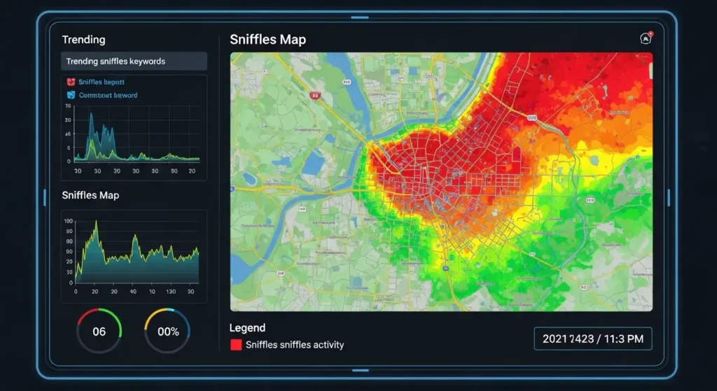
What is a Sniffles Map?
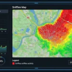
A sniffles map is a digital, often interactive visualization that tracks the spread of common respiratory symptoms and illnesses across specific geographic areas. Think of it like a weather radar, but instead of tracking rain clouds, it tracks clusters of coughs, fevers, and runny noses.
These maps aggregate data from various sources to give you a “heat map” of wellness. They allow you to zoom in on your specific zip code to see if there is an active spike in local illness. By using a sniffles map, you move from guessing about your health to making informed decisions based on community trends.
Most of these platforms rely on crowdsourced data, pharmacy sales, or clinical reports to build their visuals. When you see a bright red zone over your city, it’s a clear signal that the viral load in your community is high. It is the ultimate tool for proactive rather than reactive health management.
Sniffles Map Explained with a Real Scenario
Imagine it’s early November. You live in a suburban neighborhood and your child’s elementary school just sent home a generic flyer about “staying healthy.” You feel fine, but you’re planning a large dinner party for your elderly parents next Sunday.
You open your favorite sniffles map tool and enter your zip code. Suddenly, you see a deep orange “hot spot” centered exactly where you live. The data shows that over the last 48 hours, reports of high fevers and respiratory distress have jumped by 30% in your immediate vicinity.
Because you saw this on the map, you decide to move the dinner to a virtual call or reschedule it for two weeks later. Three days later, you wake up with a fever. Because you checked the map, you didn’t accidentally expose your high-risk parents to a virus that was clearly trending in your area. This is how data saves lives and prevents the “domino effect” of family-wide illness.
Unblocked Minecraft: How to Play at School or Work Safely
How to Use a Sniffles Map: Step-by-Step
Using these tools is straightforward, but getting the most out of the data requires a bit of strategy. Follow these steps to become a pro at local health tracking:
-
Select a Reliable Platform: Choose a map that updates daily. Look for platforms that use “anonymized data” to ensure privacy while providing accuracy.
-
Input Your Precise Location: Don’t just look at your state. Enter your specific zip code or city to see micro-trends, as illness often moves through specific school districts or transit lines first.
-
Check the “Trend Line”: Most maps show you a “Current Status” and a “Trend.” Look to see if the curve is going up or down. A high but falling rate is often less risky than a moderate but rapidly rising rate.
-
Filter by Symptom: If the tool allows, filter for the specific symptoms you are worried about, such as “fever” or “cough.” This helps you distinguish between a local allergy flare-up and a viral outbreak.
-
Contribute Your Own Data: Most maps thrive on community input. If you are feeling under the weather, report your symptoms anonymously. This helps your neighbors stay informed just as their data helped you.
Common Mistakes People Make
The most frequent error is panic-reacting to a single data point. A small cluster of illness in a high-density area like a university or an apartment complex might turn a map red, but it doesn’t necessarily mean the entire city is at risk. Always look at the broader context of your daily movements.
Another mistake is ignoring the “Last Updated” timestamp. Some older or less-maintained maps might show data from two weeks ago. In the world of respiratory viruses, two-week-old data is ancient history. Always ensure you are looking at a sniffles map that has been refreshed within the last 24 to 48 hours.
Lastly, people often confuse “symptom maps” with “confirmed case maps.” A symptom map tells you people are feeling sick; a case map (like those provided by hospitals) tells you people have been tested and diagnosed. Both are useful, but symptom maps are usually a “leading indicator,” meaning they show the spread before people actually make it to the doctor’s office.
Sniffles Map vs. Traditional CDC Reports
Understanding the difference between these two data sources is vital for your personal health strategy.
| Feature | Sniffles Map (Crowdsourced/Digital) | CDC/Traditional Health Reports |
| Data Speed | Near real-time (24-48 hours) | Delayed (usually 1-2 weeks) |
| Granularity | Zip code or neighborhood level | State or regional level |
| Source | Smart thermometers, app entries, search trends | Lab tests and physician reports |
| Accuracy | High for trends, lower for specific diagnosis | Gold standard for clinical diagnosis |
| Best Use | Daily planning and early warning | Long-term policy and official statistics |
Pro Tips and Best Practices
To maximize the utility of a sniffles map, you should integrate it into your routine just like checking the weather. If you see the “viral weather” getting stormy, increase your handwashing frequency and consider wearing a mask in crowded indoor spaces.
Watch the “fringe” areas. If you live in a suburb, don’t just look at your town; look at the major city nearby where people commute. Viruses often travel along commuter rails and highways. If the city is lighting up red, your suburb is likely only 3 to 5 days behind.
Another best practice is to cross-reference with pollen counts. If your map shows a spike in “sneezing” but the local pollen count is “Extreme,” you are likely seeing an allergy event rather than a contagious outbreak. This distinction can save you from unnecessary isolation.
Frequently Asked Questions
Is my personal data safe when using a sniffles map?
Most reputable platforms use anonymized and aggregated data. This means they strip away your name and exact address, grouping your symptoms with thousands of others to show a general area trend without identifying you personally.
Can these maps tell the difference between a cold and the flu?
Not with 100% certainty. Since they rely on reported symptoms, they can only suggest what is “likely.” However, if the map shows a high density of “fever and body aches,” it is more likely to be flu or a similar virus than a common cold.
Why does my area look clear when I know people are sick?
This is often due to a reporting lag or a lack of users in your specific area. If not enough people are using the tracking tools (like smart thermometers or health apps) in your town, the map might remain “green” despite a local outbreak.
Should I show this map to my doctor?
While your doctor will rely on clinical tests for your diagnosis, mentioning that you saw a sniffles map spike in your neighborhood can be a helpful piece of context for them. It helps them understand the community prevalence of certain symptoms.
Are these maps accurate for kids?
Yes, especially maps that pull data from pediatric-focused tools. Because children are often the “primary spreaders” in a community, their symptom data is usually the first to appear on a map before it reaches the adult population.
Conclusion: Taking Control of Your Health
A sniffles map is more than just a digital curiosity; it is a shield against the unexpected. By understanding the ebb and flow of illness in your community, you can stop living in fear of the “mystery bug” and start taking proactive steps to stay well. You now have the knowledge to interpret heat maps, avoid common data mistakes, and use real-time trends to protect your family.